The Goal of this Exercise
In this example, we will atempt to recover the polynomial, \(f(x) = 0.3 \cdot x^3 - 2.0 \cdot x^2 + 4\cdot x + 1.4\) from a set of noisy observations. Specifically, we will be showing off the power of Cross-Validation to prevent overfitting.
A common problem we face in statistical analysis is discovering the model for which data was sampled from. In the case of polynomial regression, if we aren’t careful, we can “fit” the data too well—we will get more into this later in this lesson.
from matplotlib import pyplot as plt
import numpy as np
from sklearn.base import BaseEstimator
from sklearn.model_selection import GridSearchCV
from sklearn.linear_model import LinearRegression
from sklearn.metrics import mean_squared_error as MSE
The Fundamental Goal of Regression
Suppose we are given a set of inputs \(X\)—indicated by the set “A” in the figure—and a set of outputs \(Y\)—indicated by the set “B” in the figure. The goal of regression analysis to discover the “mapping,” \(f\), which relates the two sets.
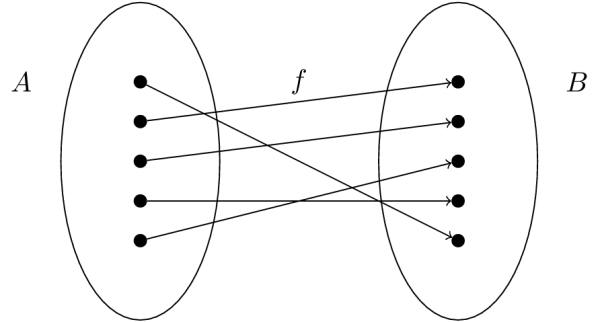
Let us start by defining our true mapping, \(f\), in Python:
def f(x):
    return (0.3 * x**3) - (2 * x**2) + (4 * x) + 1.4
Generating Some Artifical Data
We assume that our data is generated from a polynomial, \(f(x)\), of some unknown degree, from the model \(y(x)=f(X) + \epsilon\) where \(\epsilon \sim N(0, \sigma^2)\). That last piece of notation says that \(\epsilon\) are samples obtained from a Normal distribution centered at 0 with a scale (variance) of \(\sigma^2\) and is meant to reflect our state of confidence (or ignorance) about our data. By adding \(f(x)\) and \(\epsilon\) this corresponds to adding some artificial corruption to the data.

Here we will generate \(N=20\) samples from the true model, where \(x \in X \sim U(0, 3)\), that is to say \(X\) is uniformaly distributed on the interval \([0, 3]\), and add noise with variance \(\sigma^2=0.05\). And as we can tell from the figure above, a Normal distribution with that variance is rather peaky.
N = 20
var = 0.05

left = 0
right = 3

# Generate N random samples on the interval [0,3] sampled from a uniform distribution
X = np.random.uniform(low=left, high=right, size=N)

# Generate some N random samples on the interval [0, sigma] sampled from a normal dist.
epsilon = np.random.normal(0, np.sqrt(var), size=N)

# y represents our signal under the "corruption" of the noise
y = f(X) + epsilon
Now that we created our “x” and “y” values let us visualize (1) the true polynomial and (2) the measurments for which we need to extract the underlying model from.
plot_X = np.linspace(left, right, 100)

fig = plt.figure(figsize=(16,9))
ax = plt.gca()

ax.plot(plot_X, f(plot_X), '--', label="True Mapping")
ax.plot(X, y, '.', ms=15, label="Noisy Observations")

ax.set_xlim(0,3)
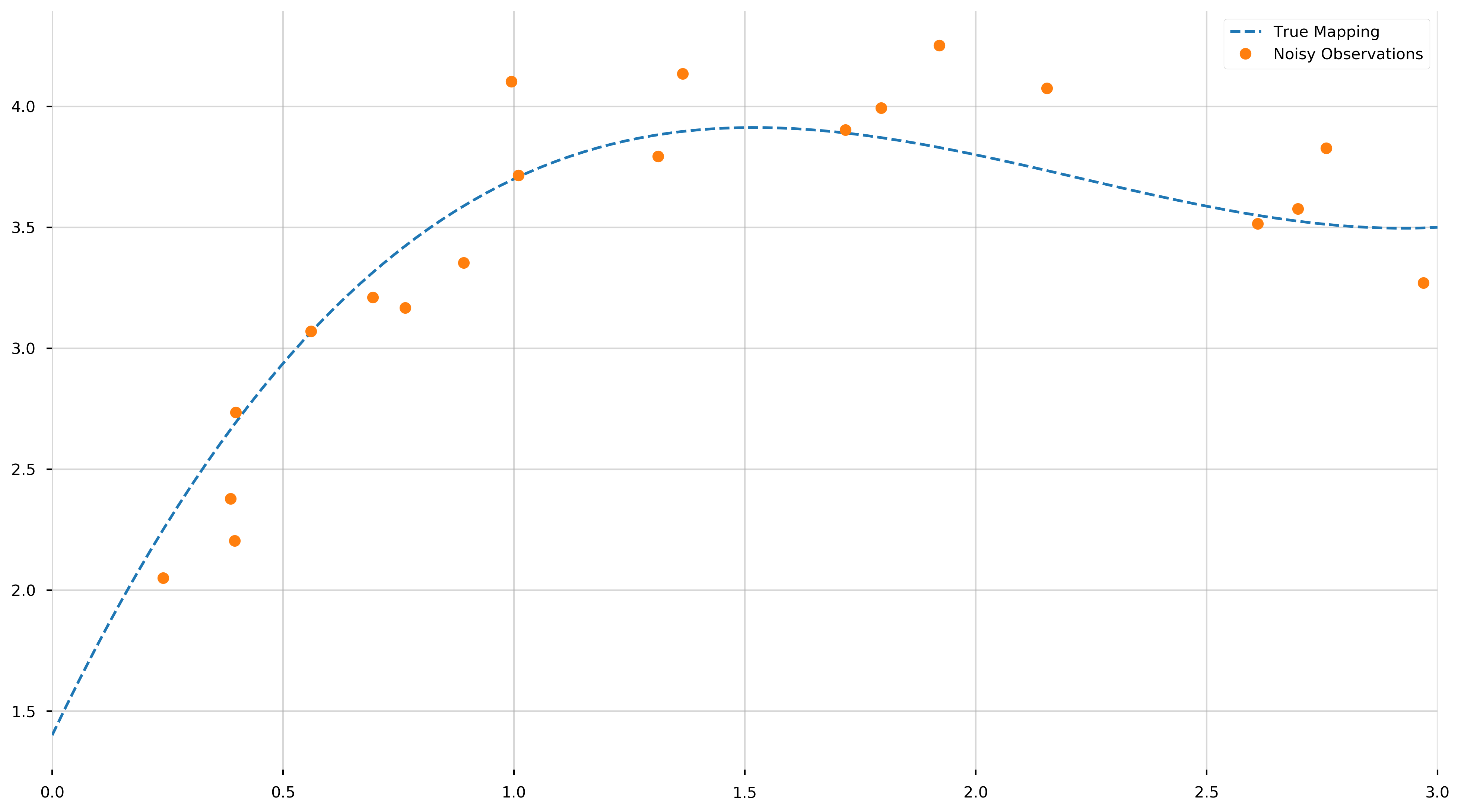
Remember, we haven’t “fit” anything yet—merely displayed the true polynomial we would like to uncover from the data. As we can see, objectively uncovering the underlying model may be tricky.
A Pipeline to Fit Polynomials
Without diving too much into the theory, polynomial regression finds the least squares relationship between the observed responses and the Vandermonde matrix (in our case, computed using numpy.vander) of the observed predictors. Note, if you would like to work with the scikit-learn framework, you could obtain similar results with sklearn.preprocessing.PolynomialFeatures. For those unfamiliar, the Vandermonde matrix is an \(m\times n\) matrix of the form,
The Vandermonde matrix allows us to express the coefficients of the polynomial in terms of the \(\alpha_{i}\) and the values of the polynomial at the \(\alpha_i\). Here is an example to hopefully make the picture clearer,
_x = np.array([1, 2, 3])

np.vander(_x, 3)
array([[1, 1, 1],
       [4, 2, 1],
       [9, 3, 1]])
What we did is take the array _x and specify that we would like to generate a Vandermonde matrix with 3 columns in the ouput. Here are the calculations, row by row,
- [\(1^2\), \(1^1\), \(1^0\)]
- [\(2^2\), \(2^1\), \(2^0\)]
- [\(3^2\), \(3^1\), \(3^0\)]
This may be look flipped in comparison to the matrix above, but the mechanics are the same.
A Comment on the scikit-learn Framework
The scikit-learn library provides a great API for experimenting with a comprehensive list of statistical models. The general workflow is,
- Initialize some model, i.e;
LinearRegression,Ridge,SVR. - Train that model on some data, \(X\), with known output \(y\).
- Use that trained model to predict some other set of data
Using their great API, we can access various properties of the trained model.
Putting it All Together (thusfar)
What we do here is create a class for general polynomial regression. The scikit-learn library doesn’t have a function for polynomial regression, but we would like to use their great framework. In order to use our class with scikit-learn’s cross-validation framework, we derive from sklearn.base.BaseEstimator. Let this be a lesson for the reader in object inheritance.
class PolynomialRegression(BaseEstimator):
    def __init__(self, deg=1):
        self.deg = deg

    def fit(self, X, y, deg=None):
        self.model = LinearRegression(fit_intercept=False)
        self.model.fit(np.vander(X, N=self.deg + 1), y)

    def predict(self, x):
        return self.model.predict(np.vander(x, N=self.deg + 1))

    @property
    def coef_(self):
        return self.model.coef_
The PolynomialRegression class we just created depends on the degree of the polynomial to be fit. If we know the degree of the polynomial that generated the data, then the regression problem is rather straightforward.
# As mentioned above, the general workflow,
# 1. Initialize some model
known_degree_model = PolynomialRegression(deg=3)
# 2. Train the model on some data, X, and ouput, y
known_degree_model.fit(X, y)
# 3. Use that trained model to predict some other set of data
predict_y = known_degree_model.predict(plot_X)
Let us view the resulting polynomial,
fig = plt.figure(figsize=(16,9))
ax = plt.gca()

ax.plot(plot_X, f(plot_X), '--', label='True Mapping')
ax.plot(X, y, '.', ms=15, label="Noisy Observations")
ax.plot(plot_X, predict_y, label="Cross-validated Estimator")

ax.set_xlim(0,3)

print(f"Coefficients: {known_degree_model.coef_}")
Coefficients: [ 0.18255334 -1.63301038 3.98553076 1.15626285]
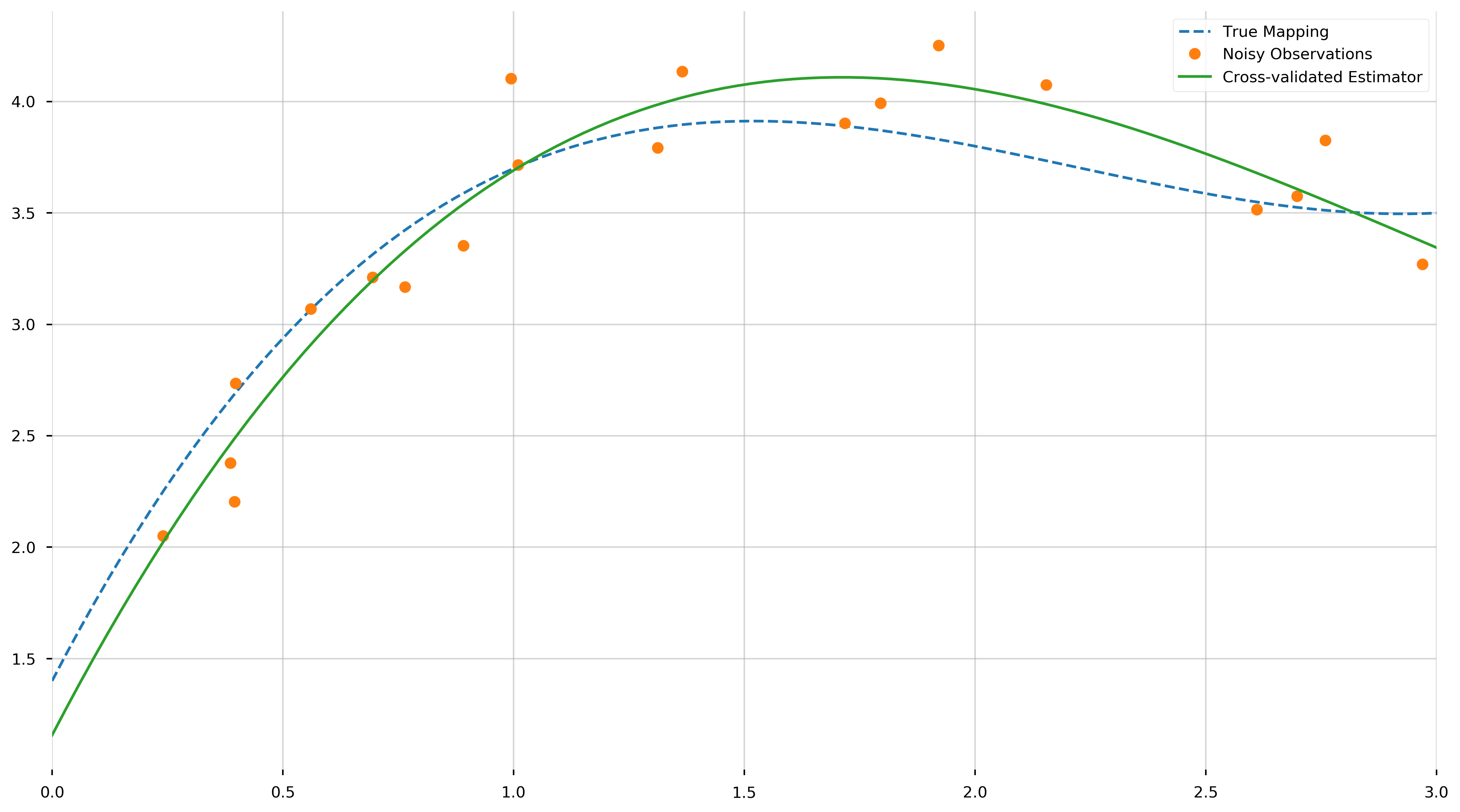
These values are the coefficients of the fit polynomial, starting with the coefficient of \(x^3\). We see that they come reasonably close to the true values, from a relatively small set of samples. As neat and tidy as this solution is, we are concerned with the more interesting case where we do not know the degree of the polynomial. How do we tell that the data is generated from a 4th degree polynomial, a 5th, or even just a line?
A Lesson on Overfitting
We could haphazardly approach this problem by trying minimize some in-sample error of the fit polynomial, that is to say, minimize some overall cost function across the set of training examples. If our set of observations and knowledge are represented by \(\{(X_1, Y_1), (X_2, Y_2), \dots, (X_n, Y_n)\}\), we could be tempted to minimize the mean squared error (a common cost function is statistical analysis),
\[\text{MSE}\left(\hat{f}\right) = \sum_{i}^{N} \left(\hat{f}(X_i) - Y_i\right)^2\]To get a more indepth understanding of optimization and the choice of cost functions, see my optimization notes, HERE.
However, there will be some major pitfalls if we follow this approach naively. Suppose we had two datapoints, we can fit that data with a line and achieve 100% accuracy. Similarly, if we have three data points, we can perfectly fit that with a quadratic. If we continue this process, we can quickly see—no matter the amount of observations—if we specify a \(N-1\) degree polynomial it will express the data with near perfect accuracy. This is an example of overfitting over overparameterization. If you have a hard time visualizing this, take the time to draw some examples to convince yourself.
To visualize this, let us fit an \(N-1\) degree polynomial to our observations \(X\) and \(y\).
overfit_model = PolynomialRegression(deg=N - 1)
overfit_model.fit(X, y)

print(f"Coefficients: {overfit_model.coef_}")
Coefficients: [ 9.02533074e+00 -1.85680576e+02  1.67740838e+03 -8.66891335e+03
  2.77985372e+04 -5.51394212e+04  5.94419412e+04 -1.03738908e+04
 -4.99221030e+04  3.31012016e+04  4.01782715e+04 -4.20719925e+04
 -3.43018024e+04  5.23843715e+04  1.86075237e+04 -7.02671392e+04
  5.49131564e+04 -2.08470731e+04  3.96910137e+03 -2.98659424e+02]
As we can see, we fit a 19th degree polynomial. Let us try to visualize (1) the true mapping, (2) the noisy observations, and (3) the overfit model. We will be using the np.clip to trim the fit function because it oscillates quite vigorously.
plot_X = np.linspace(left, right, 100)

fig = plt.figure(figsize=(16,9))
ax = plt.gca()

ax.plot(plot_X, f(plot_X), '--', label="True Mapping")
ax.plot(X, y, '.', ms=15, label="Noisy Observations")
ax.plot(plot_X, np.clip(overfit_model.predict(plot_X), -1, 7), label="Overfit Estimator")

ax.set_xlim(0,3)
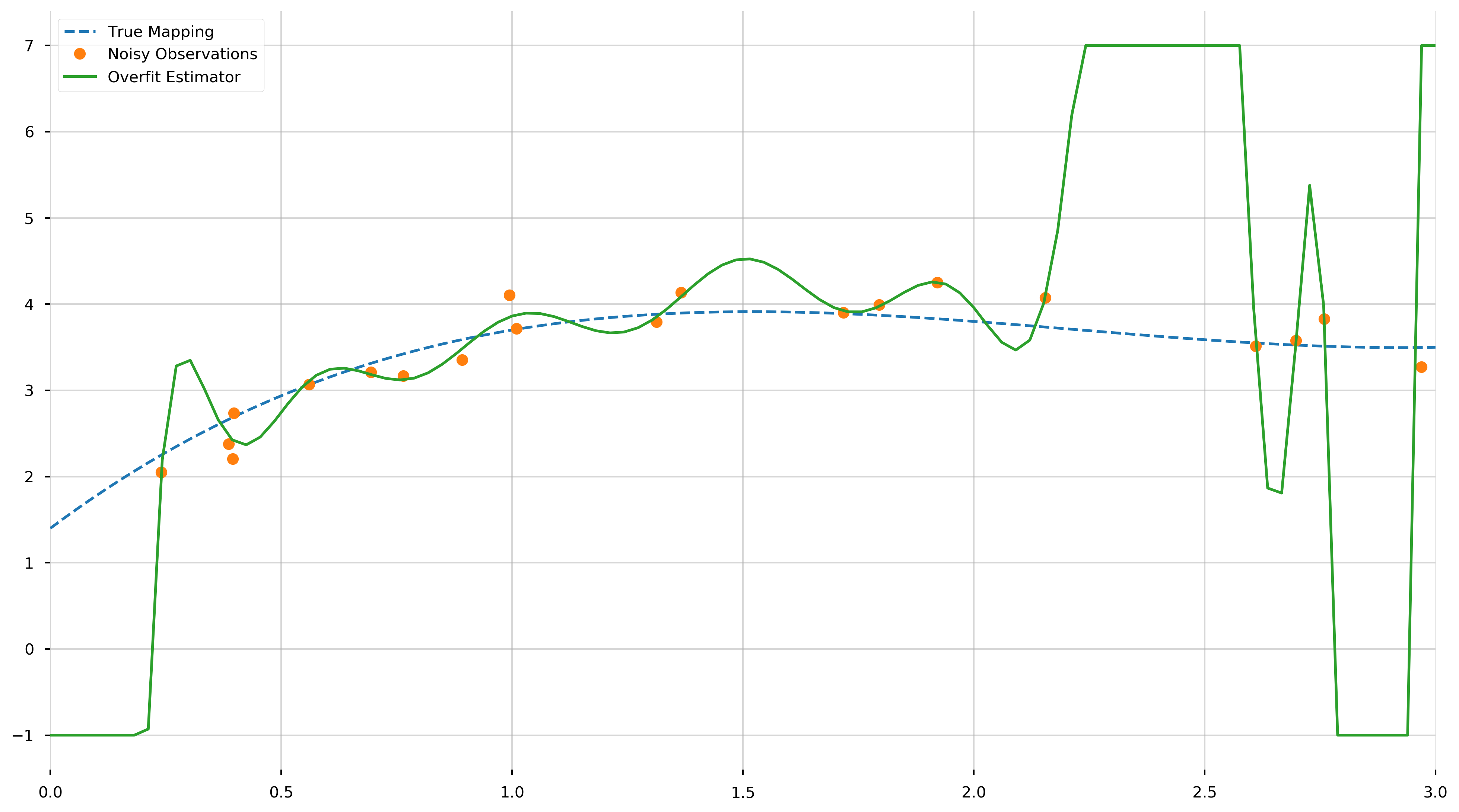
As we can see from this plot, the fitted \(N-1\)-degree polynomial is significantly less smooth than the true polynomial, \(f\). This roughness results from the fact that the \(N−1\)-degree polynomial has enough parameters to account for the noise in the model, instead of the true underlying structure of the data. Such a model is called overparametrized or overfit. If we inspect the MSE, we find it is extremely small, this is because we learned to fit the training data almost perfectly.
print(f"MSE [Training]: {MSE(overfit_model.predict(X), y)}")
MSE [Training]: 0.013894313269764941
This may seem great in theory, however this model will not perform as well when used to predict the value of \(f\) at points not in the training set. (Note that this in-sample error should theoretically be zero. The small positive value is due to rounding errors.) To illustrate this inaccuracy, we generate ten more points uniformly distributed in the interval \([0,3]\) and use the overfit model to predict the value of \(f\) at those points. We will call this set the testing set.
N_prediction = 10

prediction_X = np.random.uniform(low=left, high=right, size=N_prediction)
prediction_eps = np.random.normal(0, np.sqrt(var), size=N_prediction)
prediction_y = f(prediction_X) + prediction_eps
plot_X = np.linspace(left, right, 100)

fig = plt.figure(figsize=(16,9))
ax = plt.gca()

ax.plot(plot_X, f(plot_X), '--', label="True Mapping")
ax.plot(X, y, '.', ms=15, label="Noisy Observations (Training Set)")
ax.plot(plot_X, np.clip(overfit_model.predict(plot_X), -1, 7), label="Overfit Estimator")
ax.plot(prediction_X, prediction_y, '.', ms=15, label="Noisy Observations (Testing Set)")

ax.set_xlim(0,3)

print(f"MSE [Testing]: {MSE(overfit_model.predict(prediction_X), prediction_y)}")
MSE [Testing]: 3425.6355273132854
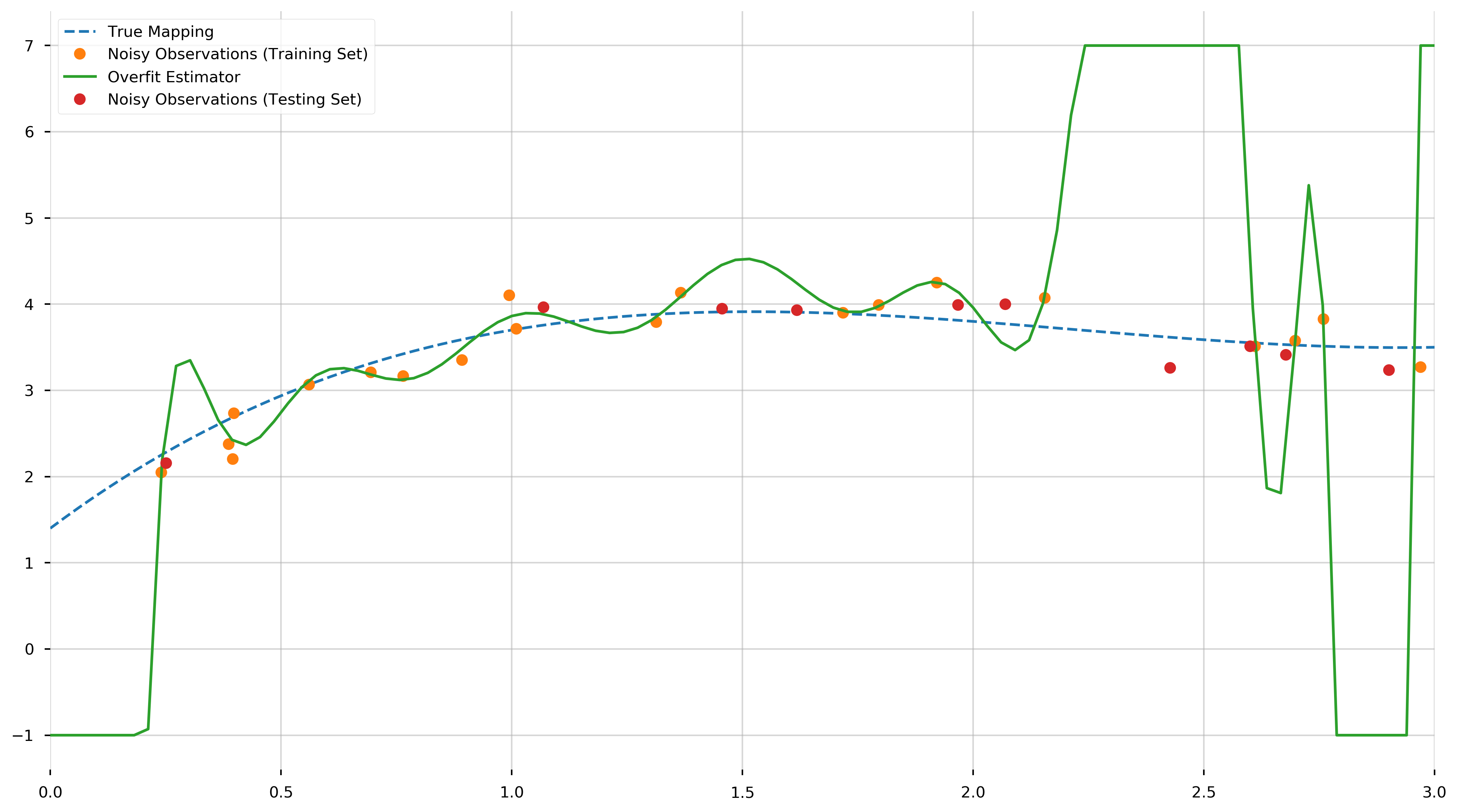
And as we can see, this is many orders of magnitude greater than MSE observed in the training set. This awful predictive performance of a model with excellent in-sample error illustrates the need for cross-validation to prevent overfitting.
K-Fold Cross-Validation
k-fold cross-validation is a resampling procedure used to evaluate the performance of statistical models on unseen data. By using unseen data to fine tune a generalized model, we can estimate how this model is expected to peform when used to make predictions about data not “seen” during the training of the model.
The term “k-fold” refers to the number of groups to split our training data into. For example, if we specify \(k=3\), we would be conducting 3-fold cross-validaton.
The general procedure is as follows:
- Shuffle the dataset randomly.
- Split the dataset into k groups
- For each unique group:
- Take the group as a hold out or test data set
- Take the remaining groups as a training data set
- Fit a model on the training set and evaluate it on the test set
- Retain the evaluation score and discard the model
- Summarize the skill of the model using the sample of model evaluation scores
Here we use scikit-learn’s GridSearchCV to choose the degree of the polynomial using three-fold cross-validation. We constrain our search to degrees between one and twenty-five. Also. GridSearch refers to the process where we will methodically “walk” through some parameter space to find an optimal set of parameters. In this example, our paramters space is one-dimensional comprised of the “degrees” we want to test.
estimator = PolynomialRegression()
degrees = np.arange(1, 25)
cv_model = GridSearchCV(estimator, # the model we wish to optimize
                        cv=3, # k-folds
                        param_grid={'deg': degrees}, # the parameter grid
                        scoring='neg_mean_squared_error')
cv_model.fit(X, y)
GridSearchCV(cv=3, error_score='raise-deprecating',
             estimator=PolynomialRegression(deg=1), iid='warn', n_jobs=None,
             param_grid={'deg': array([ 1,  2,  3,  4,  5,  6,  7,  8,  9, 10, 11, 12, 13, 14, 15, 16, 17,
       18, 19, 20, 21, 22, 23, 24])},
             pre_dispatch='2*n_jobs', refit=True, return_train_score=False,
             scoring='neg_mean_squared_error', verbose=0)
print(f"Optimal Polynomial Degree: {cv_model.best_params_}")
print(f"Coefficients: {cv_model.best_estimator_.coef_}")
Optimal Polynomial Degree: {'deg': 3}
Coefficients: [ 0.18255334 -1.63301038  3.98553076  1.15626285]
We see that cross-validation has chosen the correct degree of the polynomial, and recovered the same coefficients as the model with known degree.
fig = plt.figure(figsize=(16,9))
ax = plt.gca()

ax.plot(plot_X, f(plot_X), '--', label='True Mapping')
ax.plot(X, y, '.', ms=15, label="Noisy Observations")
ax.plot(plot_X, np.clip(overfit_model.predict(plot_X), -1, 7), label="Overfit Estimator")
ax.plot(plot_X, cv_model.predict(plot_X), label="Cross-validated Estimator")

ax.set_xlim(0,3)
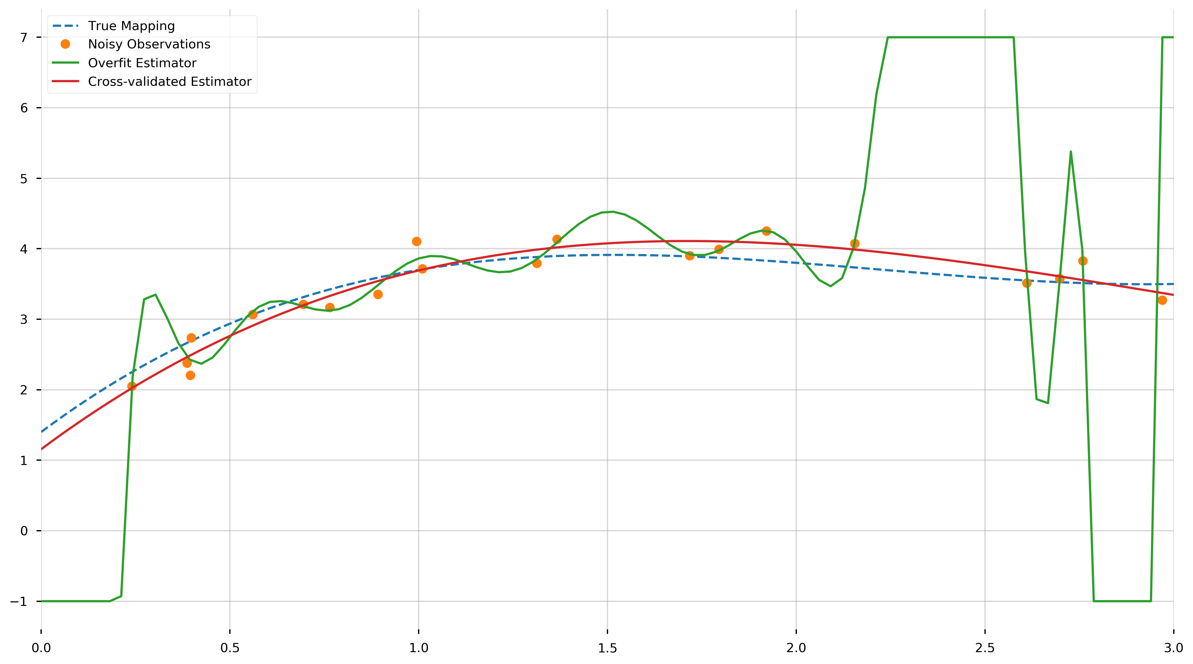
We see that the cross-validated estimator is much smoother and closer to the true polynomial than the overfit estimator. The MSE of the cross-validated estimator across the training samples,
print(f"MSE [Training]: {MSE(cv_model.predict(X), y)}")
MSE [Training]: 0.033135589844794866
The MSE of the cross-validated estimator across the testing samples,
print(f"MSE [Testing]: {MSE(cv_model.predict(prediction_X), prediction_y)}")
MSE [Testing]: 0.051832906119513154
These errors are much closer than the corresponding errors of the overfit model.
To further illustrate the advantages of cross-validation, we show the following graph of the negative score versus the degree of the fit polynomial.
fig = plt.figure(figsize=(16,9))
ax = plt.gca()

scores = np.array(cv_model.cv_results_['mean_test_score'])

ax.errorbar(degrees, -scores)
ax.set_yscale('log')
ax.set_ylabel('-(Mean Squared Error)')
ax.set_xlabel('Polynomial Degree')

ax.set_xlim(1,24)
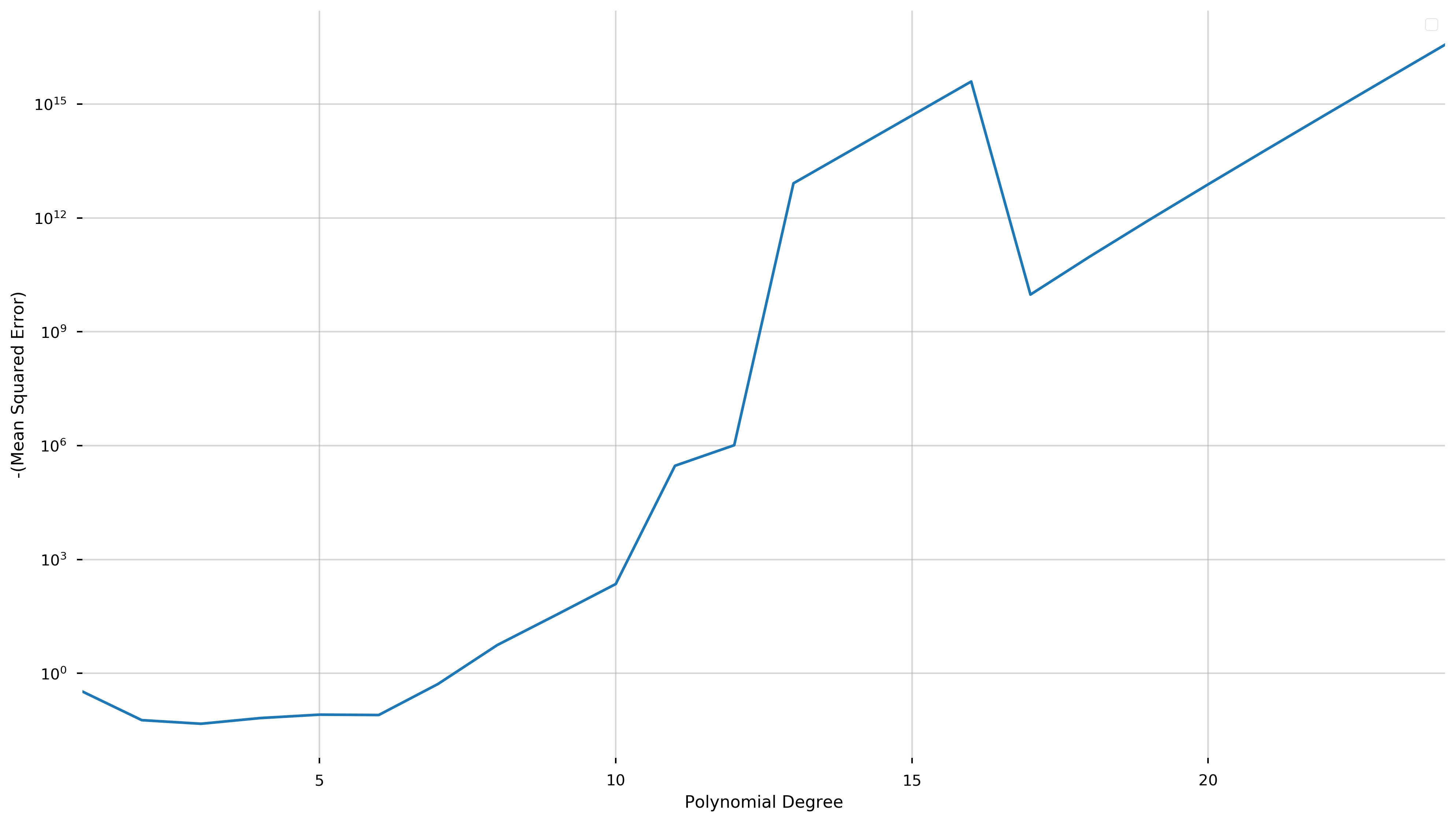
The cross-validation process seeks to maximize a score (equivalent to minimizing the negative score). Here, we have plotted negative score here in order to be able to use a logarithmic scale.
We see that this quantity is minimized at degree three and explodes as the degree of the polynomial increases (note the logarithmic scale). While overfitting the model may decrease the in-sample error, this graph shows that the cross-validation score and therefore the predictive accuracy increases at a phenomenal rate.